

Gold-Textured Retail Display Counter: Opulent Functional Hub For High-End Boutiques
Dec 19, 2025
Gold-Textured Display Counter: Elevating High-End Boutique Retail Through Luxury & Function
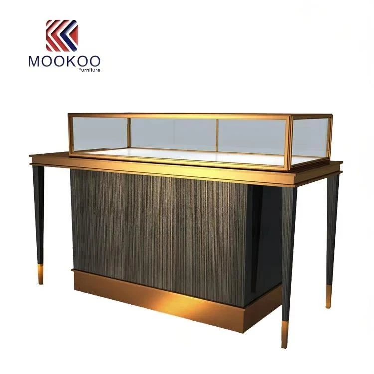
"Lume & Lace"-a 200-square-foot 轻奢 boutique in Central Hong Kong, specializing in 18k gold minimalist jewelry and niche Swiss watches (priced $800–$2,500)-once faced a paradox of luxury retail: its products felt premium, but its display did not. For six months, the shop used a generic clear glass counter: its plain metal frame clashed with the warm tones of 18k gold necklaces, watches were jumbled with earrings (making shoppers miss niche styles), and staff wasted 10 minutes per customer retrieving backup watch bands from a locked backroom cabinet. Sales of the shop's flagship gold "Crescent" necklace lagged 22% below projections; customers would glance at the counter, then leave-telling owner Chloe, "The pieces feel nice, but the display looks cheap."
Then Chloe installed the Mookoo gold-textured display counter-and everything shifted.
First, the counter's design fixed the "luxury disconnect." The brushed gold frame (not shiny, but warm and tactile) mirrored the 18k gold of the boutique's jewelry: when a customer leaned in to inspect a "Crescent" necklace, the frame's tone complemented the piece, making the $1,200 price tag feel earned. The dark vertical-texture panel added depth without distraction: its subtle lines gave the counter a "hand-finished" vibe (aligning with the boutique's "curated, not mass-produced" brand) while hiding smudges or scuffs that plagued the old glass counter.
Next, the counter's layout solved the "clutter and efficiency" problem. Chloe partitioned the transparent top zone into two sections: left for gold jewelry (arranged by style-necklaces, earrings, rings), right for niche watches (grouped by case size, so shoppers could quickly find 38mm "everyday" styles). This cut generic shopper questions (e.g., "Do you have small watches?") by 40%. The hidden lower storage-tucked behind the texture panel-was a game-changer: Chloe sorted backup inventory by category (jewelry in left drawers, watches in right) so staff retrieved a 16-inch necklace chain in 2 minutes (down from 10).
The impact showed in the numbers:
In the first month, "Crescent" necklace sales rose 28%: Customers now commented on how the counter "made the gold look richer."
Checkout flow speed increased 25%: Faster inventory retrieval meant no more shoppers waiting impatiently.
Customer dwell time jumped 20%: Shoppers lingered to browse the partitioned zones, often adding a watch to a jewelry purchase (set sales rose 18%).
A regular customer, James, summed up the shift: "Before, the counter felt like a department store rack. Now, this case makes every piece feel like something I'd save up for-like it's special."
What made the Mookoo counter work for "Lume & Lace" wasn't just its luxury design-it was its practicality. During holiday pop-ups, Chloe swapped the jewelry zone for limited-edition Christmas watch bands; the counter's modular top let her rearrange displays in 15 minutes (down from 1 hour with the old cabinet). The texture panel's durability also mattered: in a high-traffic Central location, it showed no scuffs after 3 months-unlike the old glass counter, which needed weekly polishing.
For high-end boutiques like "Lume & Lace," the Mookoo gold-textured counter isn't just a display fixture-it's a brand aligner. It proves that luxury retail doesn't require flashy, impractical design: by merging understated opulence, intentional zoning, and hidden efficiency, it turns a basic counter into a tool that elevates both the goods and the shopping experience.


